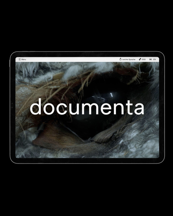
documenta 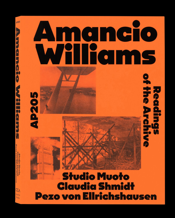
Amancio Williams – Readings of the Archive 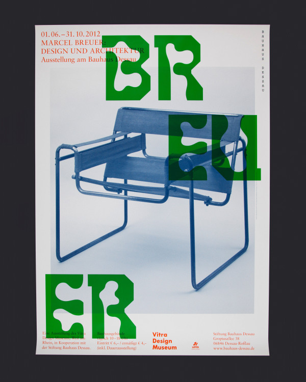
Bauhaus Dessau 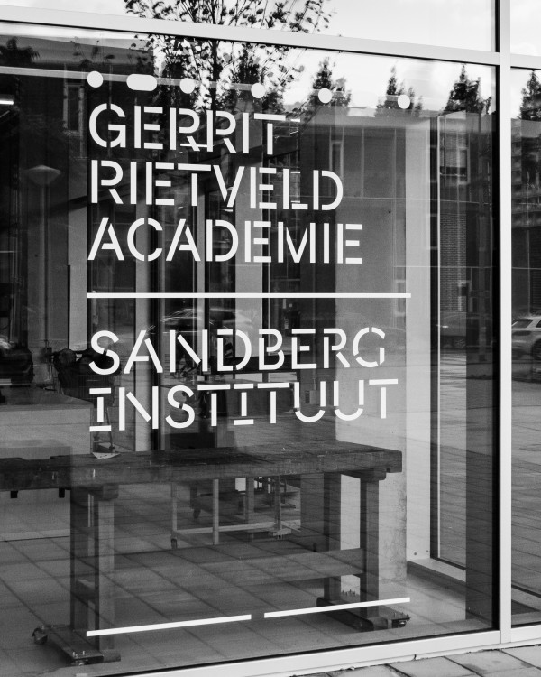
Rietveld/Sandberg Signage 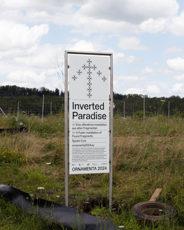
Ornamenta 2024 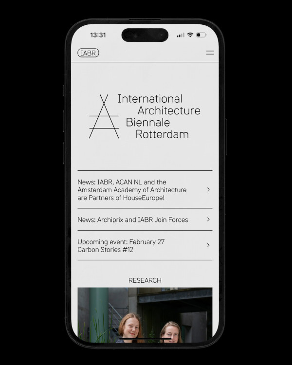
IABR 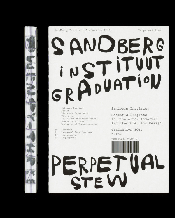
Sandberg Instituut graduation shows 2016–2018 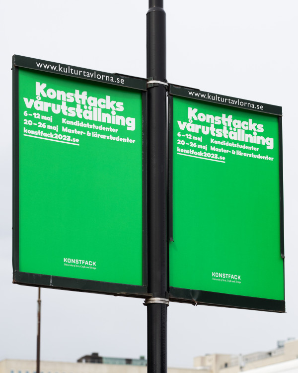
Konstfack degree exhibition 2023 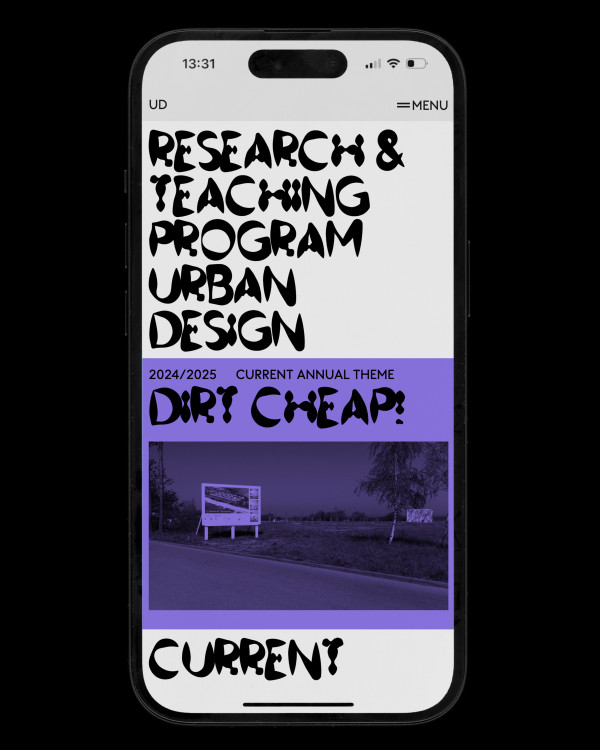
Urban Design 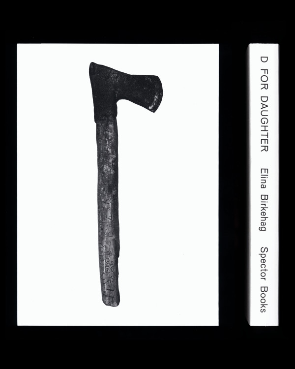
D For Daughter 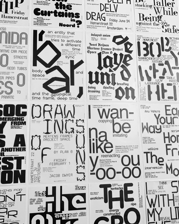
Plan B Projects 
Earth Fire Water Air 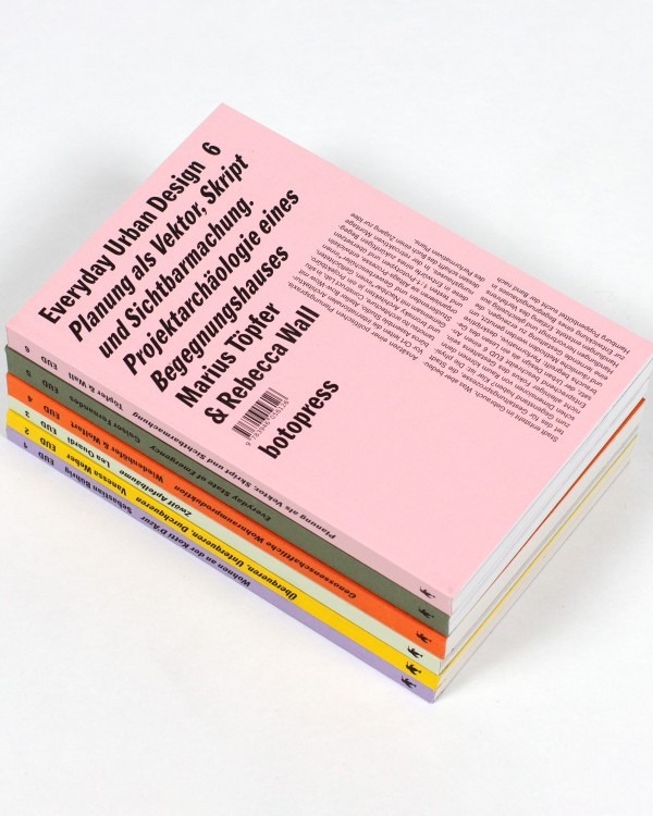
Everyday Urban Design 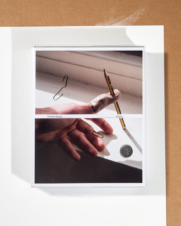
Hollow 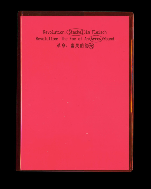
Revolution: The Foe of An Arrow Wound 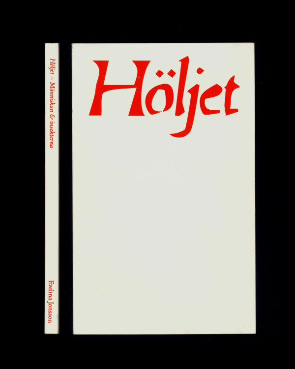
Höljet 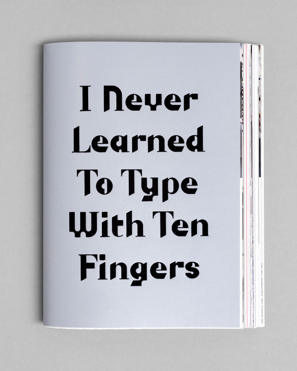
I Never Learned To Type With Ten Fingers 
One-to-One Reader 
Hook Echo 
The Fold 
11"x17" Reader 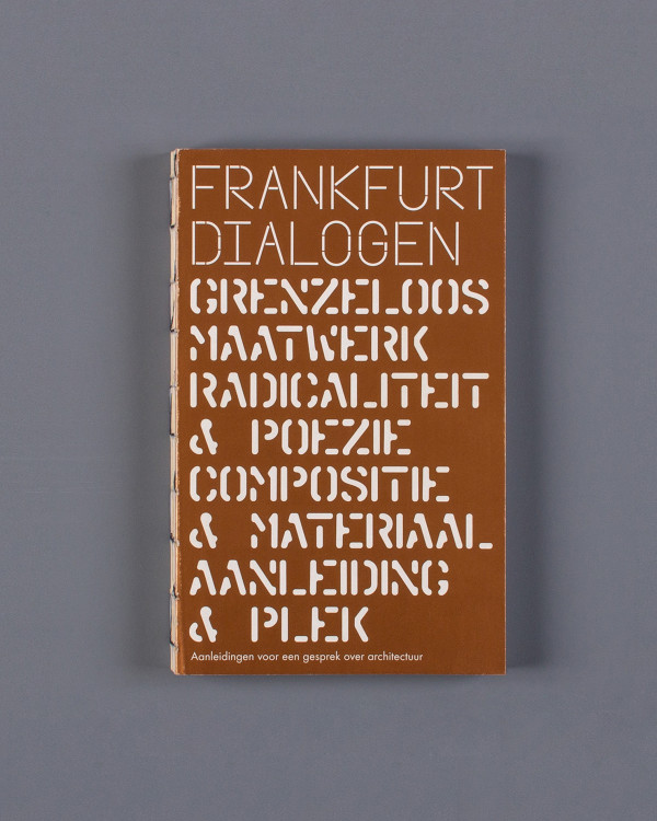
Frankfurt Dialogen 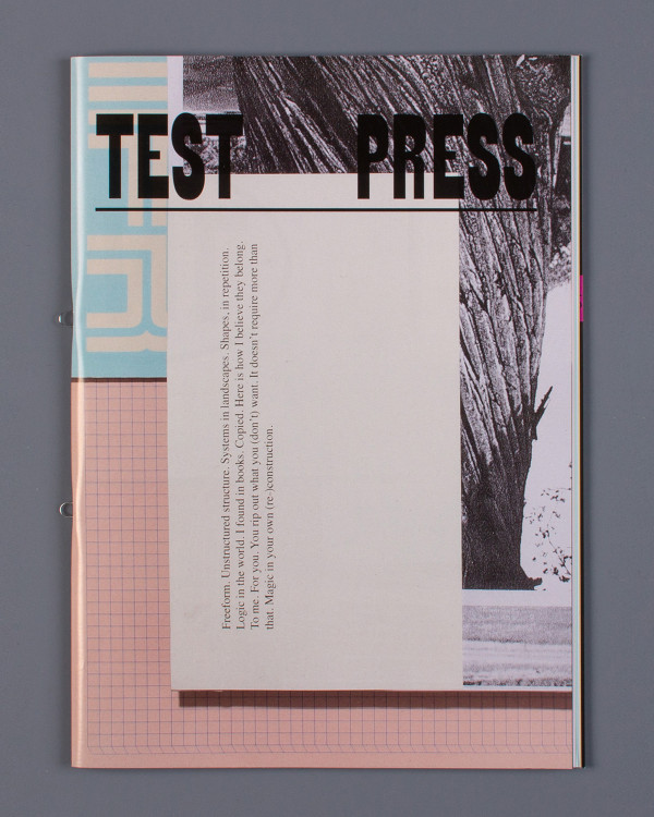
Test Press 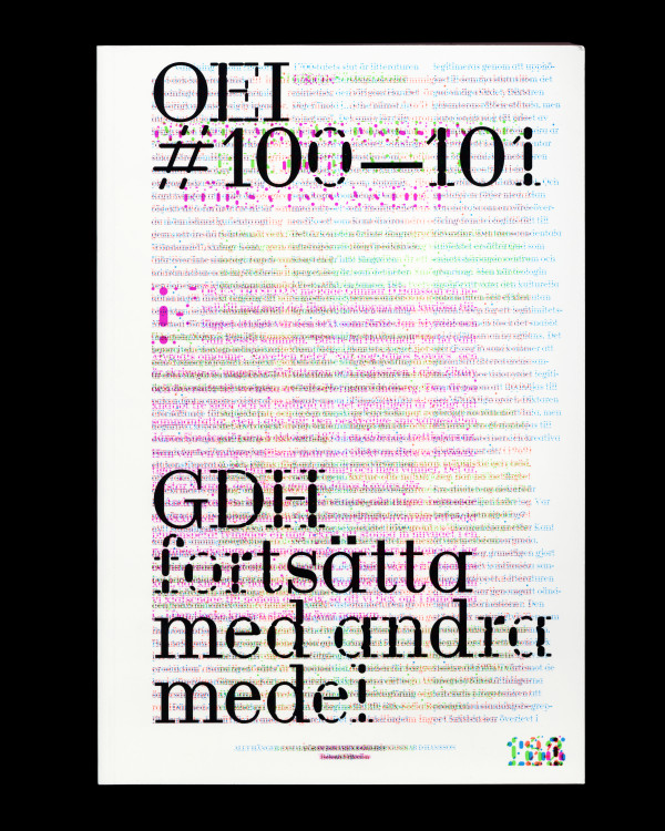
OEI 100—101
